Okay. So that's not exactly what Kim said, but that's what I took away from the lesson.
And also, I had floating around in my mind the upcoming Texture Tuesday challenge: Include a POP of color in your photo, and add at least one layer of any of Kim's textures.
So I went in search of a POP of color, contained in an image that would rely on depth of field for expression. Well, this is a somewhat drab, colorless time of year in these parts, with only our beautifully brilliant blue Colorado sky (hard to make a little POP of color out of a whole sky)...and a plentiful selection of gaudy suburban colors - signage, vehicles, architecture. Nothing inspiring between home and work.
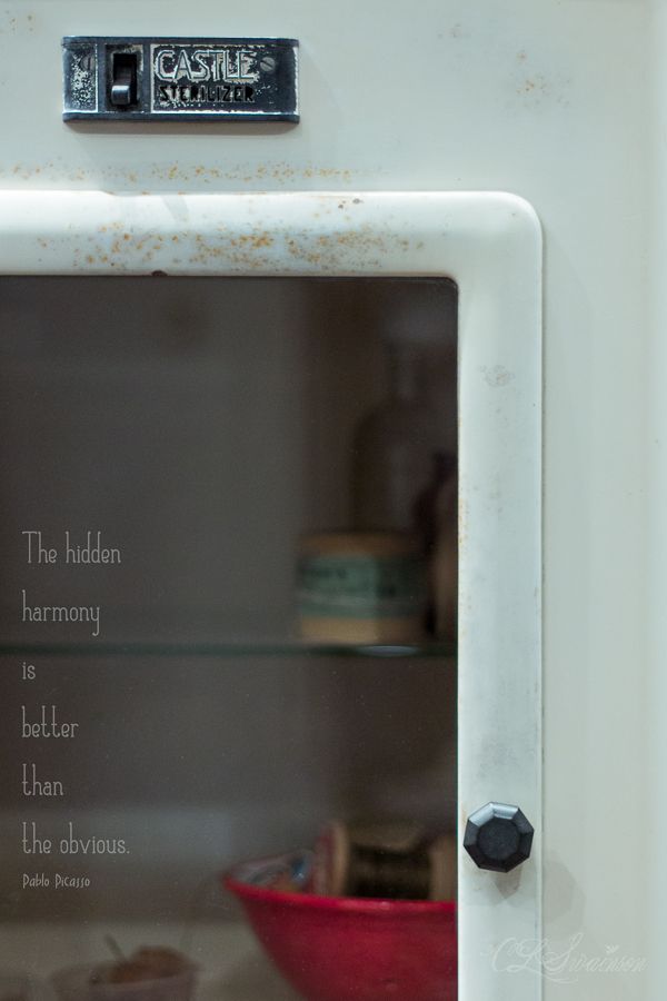
Time for a still life set-up...miraculously pulled together in my studio, focusing on a red bowl full of some old spools of thread...sitting on a shelf inside this rusty old dental cabinet/autoclave. I played around with several variations, adding the old medicine bottles and a tiny cup of acorns (I figured I could place them in the blurred zone). Moved stuff this way and that. Opened the door. Closed it. Focused on various elements. Tried several different f-stops and points of view. All the while I could feel it in my bones: there's a Subject here somewhere...
I loaded all 25 shots into Lightroom so I could cull them. The last shot was It, I was sure.
Funny thing, though: out of all the somewhat contrived compositions...there was this one that cried out in a small voice,
"pick me"
I've learned to listen to small voices...
mouse over to see the original
After a careful bit of straightening and cropping in Lightroom (I can spend a long time with this, trying to achieve just the right balance and harmony among the elements within the frame, as well as determining the proportions of the frame itself), I played around with white balance, exposure, and split toning, following Kim's video. But I was distracted by the tiny bit of distortion in the strong - and crucial horizontal and vertical lines, so I went to the Lens Correction panel, got out my Scott Kelby book to see how to straighten things out. Just a little "stretching" this way and that was all it took.
Then I jumped over to Photoshop, where I continued with Kim's video for guidance, adding a texture (kk_minus43 @Soft Light 49%) then toned down that layer with a Hue/Saturation adjustment layer, pulling down the yellow quite a bit and bringing back the color to my original vision (that special vintage-enamel-dentist's-office-sterile-white-with-a-turquoise-color-cast)...and which complements the red so nicely.
And then a quote. ..maybe. I wasn't sure if I even wanted a quote; I didn't want to disturb the balance and harmony I felt I had achieved. Well, I might as well try...I can always leave it out if it doesn't look good. I think I googled something like "hidden quotes" And there it was...a valuable lesson for me from a true Master. Sometimes it is better to be open to what is already there, instead of trying to make something appear.
xoxo
Cindy


I love how we all do and get something different out of Kim's lessons. I have my pictures taken for Lesson #2, but still need to process. Of course, Lesson #3 is today already. Good thing this is the off week from Kat's class. I love your quote and the pop of red, and of course all things old.
ReplyDeleteOh, the difference with the color tones - the cabinet really comes to life.
ReplyDeleteReally great shot I love the retro feel and the quote finishes it off beautifully...
ReplyDeleteTotally terrific! I love everything about this.
ReplyDelete