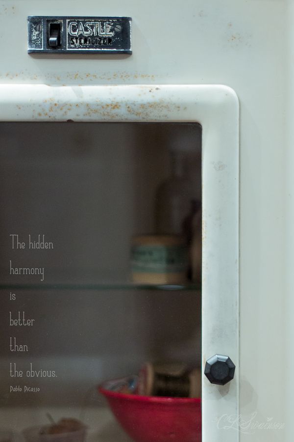
mouse over to see the original
Why the interest in genealogy and family heirlooms, especially personal effects, photos and life stories? Really, beyond a casual curiosity, what does it matter what these people looked like, where and how they lived, what joys and sorrows they experienced, or who these people were?
I suppose you could say that these items intrigue me...tangible reminders of my own ancestors, sometimes haunting me for days, months, years. I have always been drawn to true stories of old: of faith, hope and love; of honor and dignity; of survival and endurance in hard times: war, poverty, illness, desolation. These folks passed on their wisdom, their values to their children and - directly or indirectly - to their grandchildren.
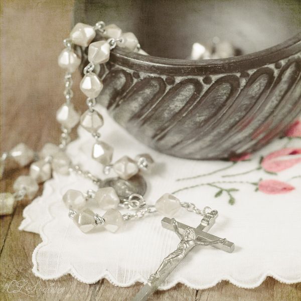
Lately I find myself thinking of the mothers in my own family in this light. Being women of faith - specifically Roman Catholic - they each prayed the rosary on a regular basis. It's not about worshiping Mary, but rather asking her to intercede, or pray for us and with us, much as you might ask a friend to pray for you or a loved one.
I think of it most often as a mother's prayer, and find myself praying for my own children and for the children of other mothers that I know. You know: from one mother to another. After all, Mary's own son was born to suffer. She will understand...
This little still life is a compilation of some of my grandmothers' things, passed on to me by my mother. The rosary and the Italian ceramic jar belonged to my paternal grandmother, Adele Libonati Notarianni. The handkerchief - adorned with embroidered rosebuds, a symbol of Mary and of the rosary (rose-ary) - is from the collection of my maternal grandmother, Edna Swanson Toomey. They would understand...
***
Linking up with Beyond Beyond, Day 5...creating light via post-processing. I used Kim's "Let There Be Light" Preset in Lightroom, and bumped up the exposure a bit. I also pulled down the yellow/gold tones, which bothered me. Then into Photoshop, where I followed Kim's "Sybil Trick" tutorial; the Color Burn layer brought back the unappealing yellow tones, so I applied a Hue/Saturation Adjustment Layer to the background layer and reduced both yellow and green. I tried Kim's "blanket of light, " but it was a no-go for this photo; it took away from the rich textural detail of the jar, which the previous processing seemed to enhance so nicely. Gotta know when to quit.
xoxo
Cindy
xoxo
Cindy